Design System

Building design and development component libraries to create delightful and consistent digital experiences

Introduction

In 2019, I joined a team that was tasked with building a comprehensive system to unify the UI across all products within the Consumer organization. This would consist of a set of reusable front-end components that along with clear guidelines could be used to build out any digital experience, but starting with our desktop products.

Together we built from scratch a comprehensive visual library in Figma and 2 corresponding UI component libraries in React and HTML/CSS, both matching up 1:1 visually for all components, their variants and interactive states.

I was an active contributor on both the design and development side, leading the efforts on documentation, ensuring proper integration with existing design specifications and working directly with developers to integrate our component libraries into product codebases.

The Design System libraries have been integrated and shipped into the 2 main desktop consumer software products with future plans to build out support for mobile and marketing endpoints.

Here is how we did it…
Atomic Design Workshop

The team attended a workshop in Austin, TX led by Brad Frost where he detailed all that goes into creating and maintaining robust design systems that would allow our organization to roll out higher quality, more consistent UIs faster than ever before. He defined a clear roadmap for how to Sell, Kick Off, Plan, Design & Build, Launch and Maintain a Design System.

“A Design System is the story of how your organization designs and builds digital products.”


Brad Frost

Author of Atomic Design

Survey

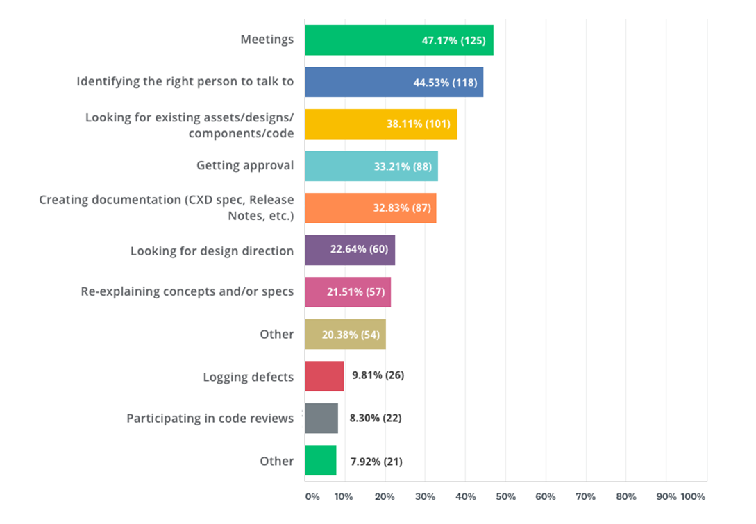
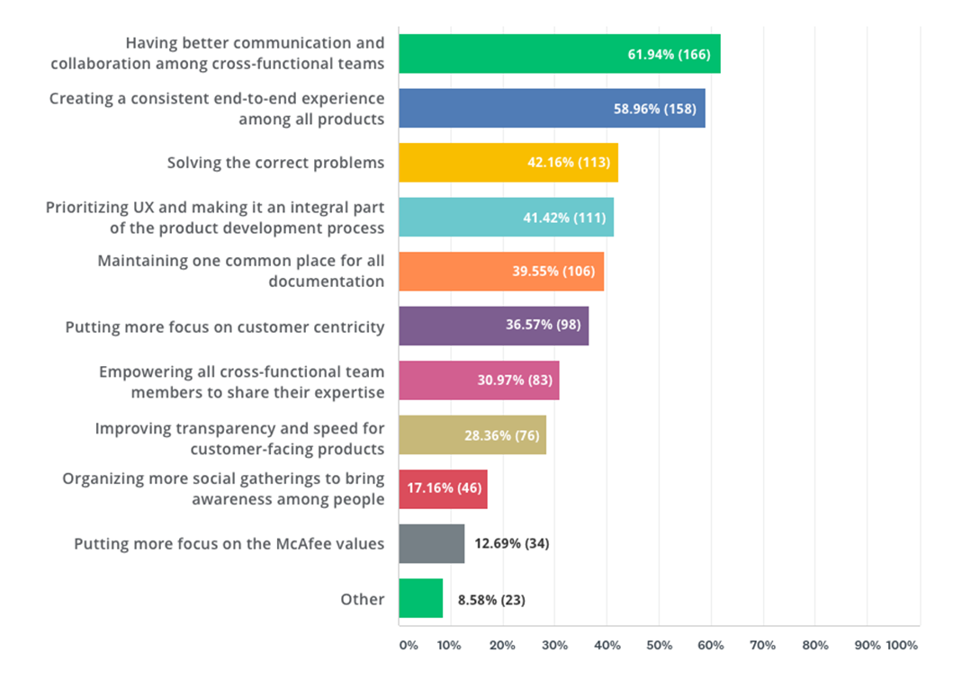
As part of the discovery process, I created a custom HTML email that was sent across the entire Consumer organization, guiding users to an online survey where they could answer questions about the pain points they experience while building digital products.

What tasks take up too much of your time?

What are the top 3 process improvements we could make to create better experiences for our customers?

Interviews

Personal interviews were conducted with participants from Engineering, Marketing, Design and Product Management with conclusions that were consistent with the surveys, especially the inconsistencies in the user experience that was mirrored in the inconsistent approaches to building products across teams. Clear communication and guidelines were also desired for an ideal collaboration environment.

Research

The team looked to what best-in-class companies were doing with their Design Systems for guidance on approaches and methodologies. Below are some of the most well respected and well documented Design Systems that informed and inspired the team.


  • Salesforce – Lightning Design System
  • Shopify – Polaris
  • Atlassian – Atlassian Design
  • Udacity – Veritas
  • Kiwi.com – Orbit

UI Audit

Screenshots

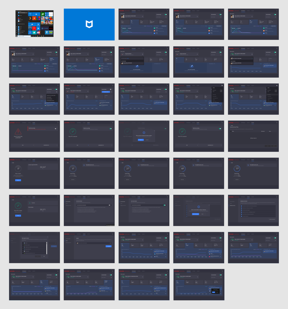
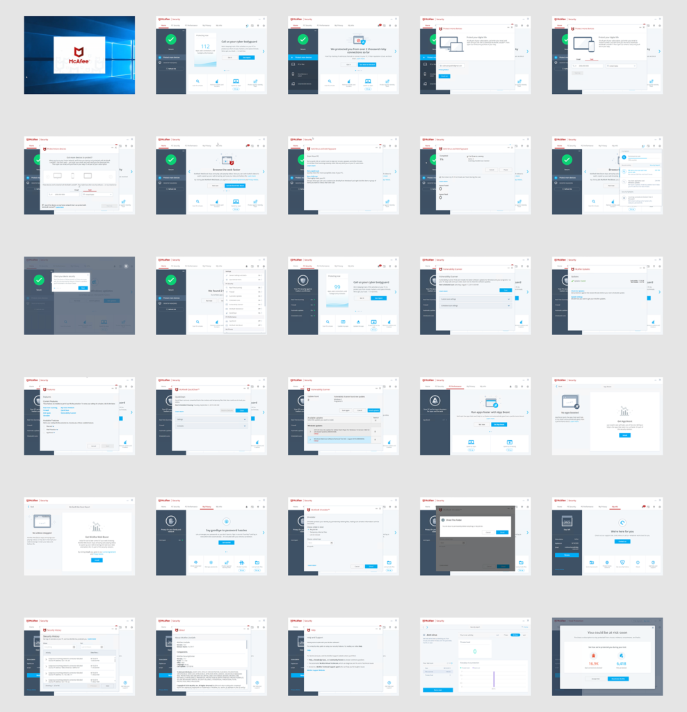
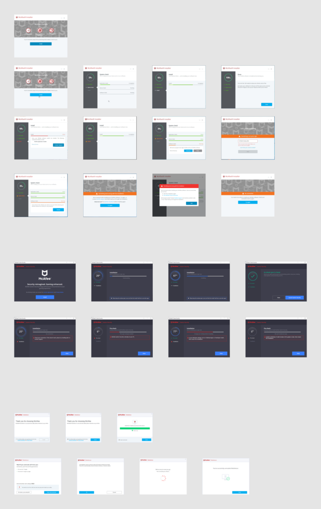
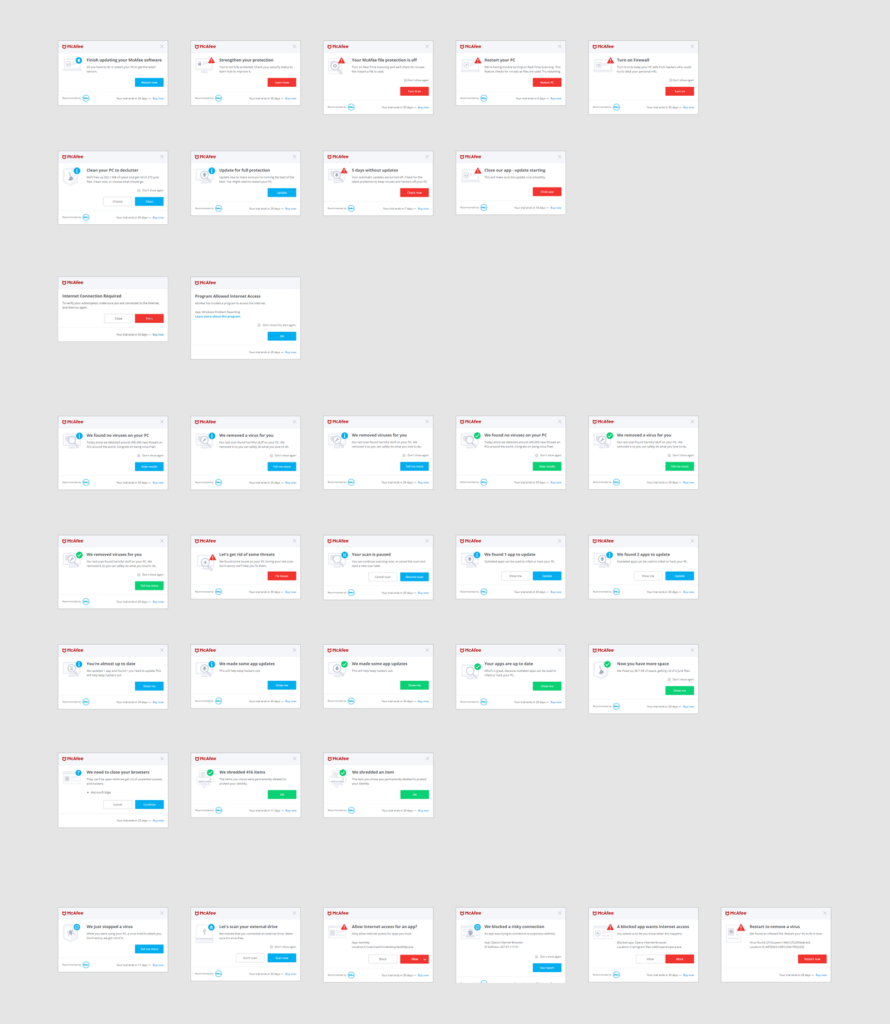
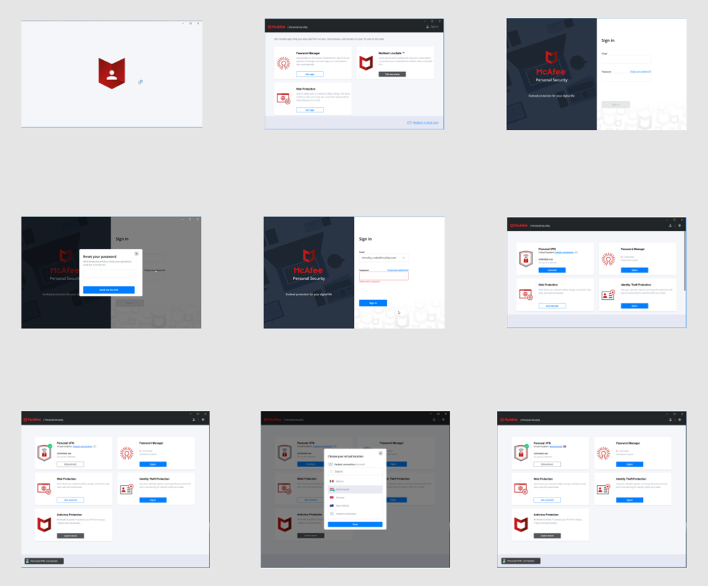
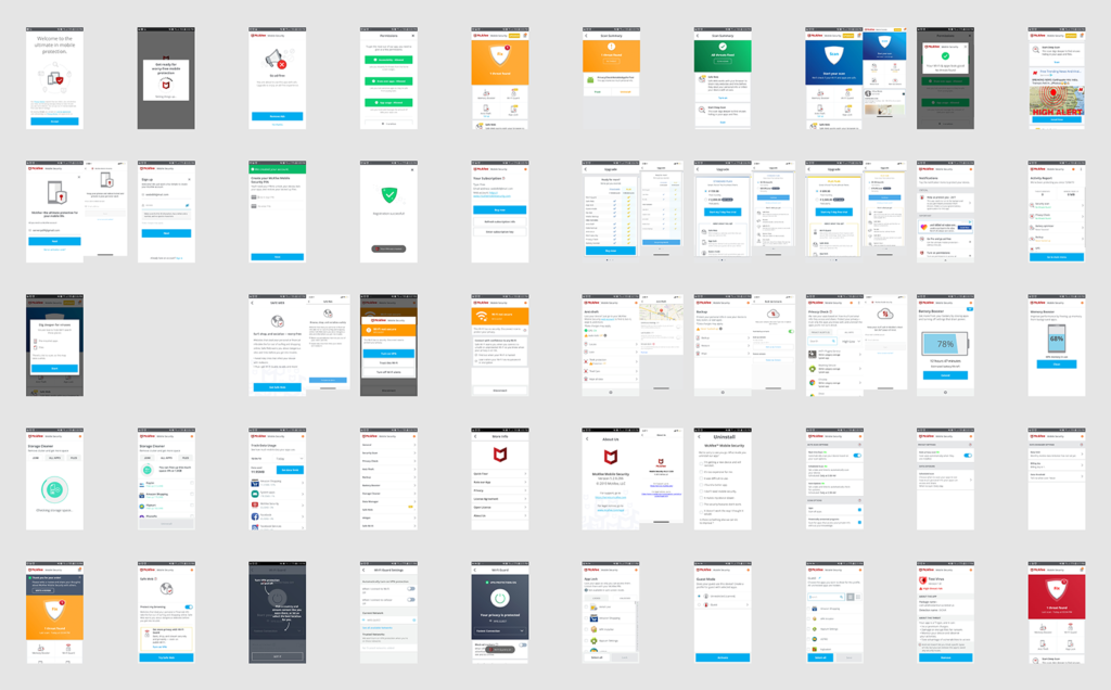
I conducted a comprehensive UI Audit of all Consumer products including setting up staging environments to capture screenshots from products as well as writing a detailed guide for taking high quality screenshots with a consistent naming convention.

Inventory

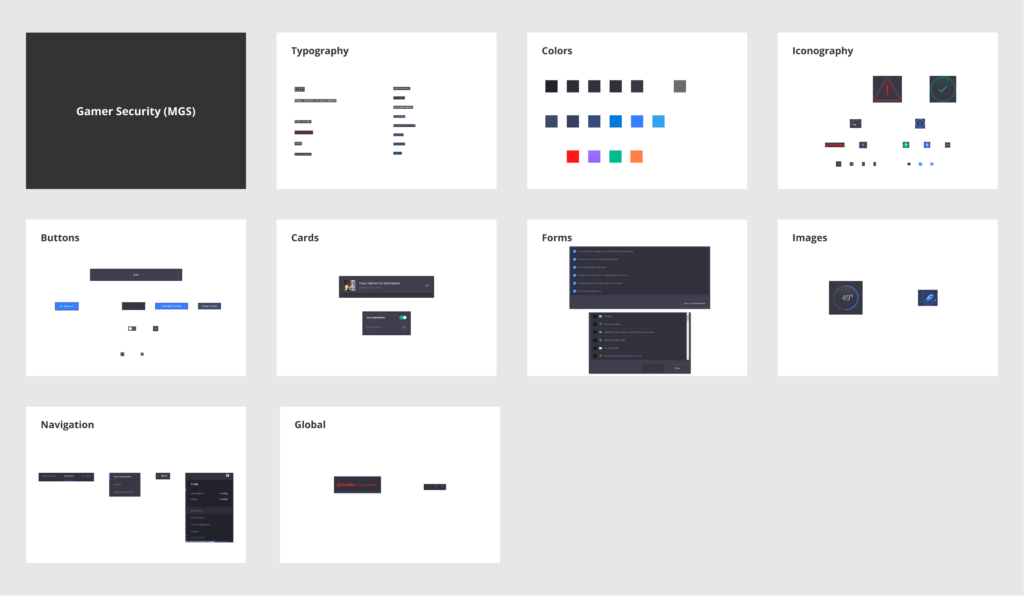
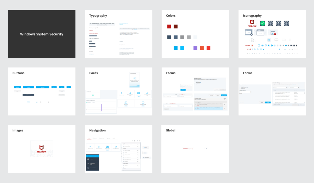
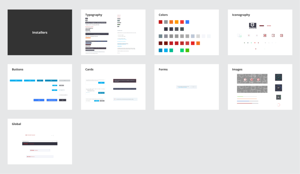
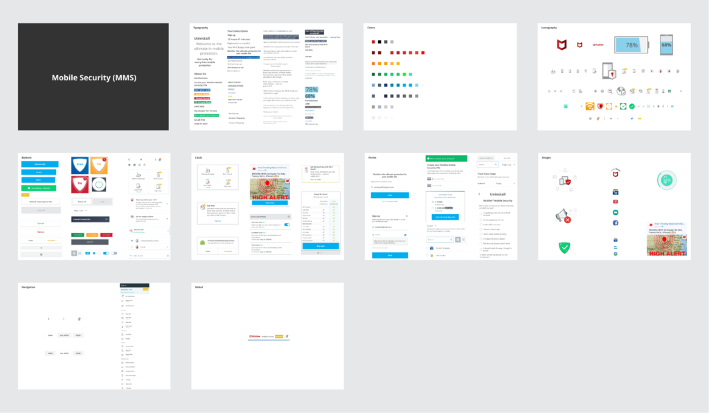
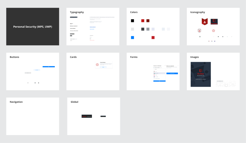
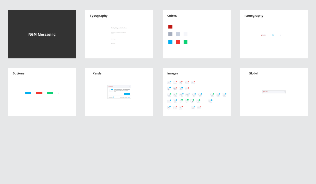
With a full set of screens on hand I was able to fully inventory all of the different components for each product including color, typography, iconography, buttons, cards, forms, images, navigation and global elements.

Planning

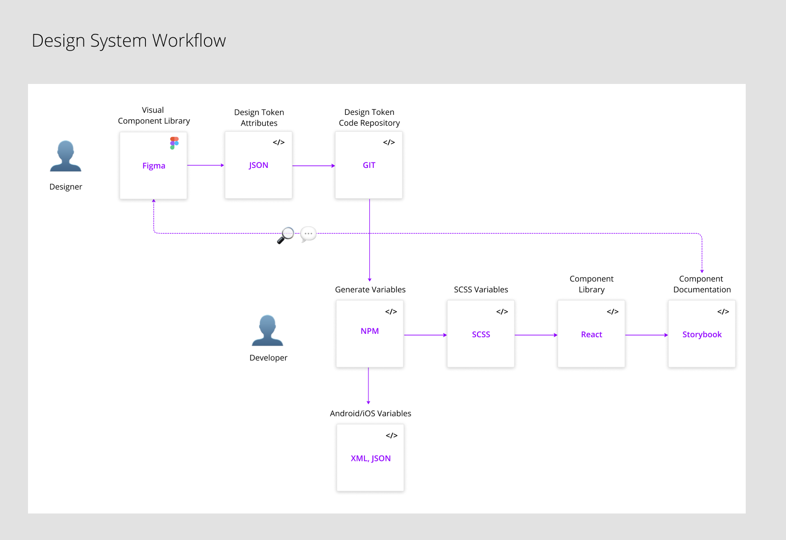
We decided to use Design Tokens as a way to store variables such as typography, color, and spacing so that the atomic elements of the Design System be transformed into formats for iOS, Android, and SCSS. We were also going to focus on a set of React components and leverage Storybook as a way to document and share those components in a documentation site.

Design

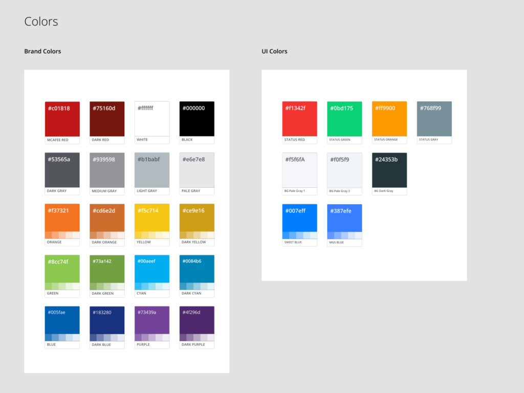
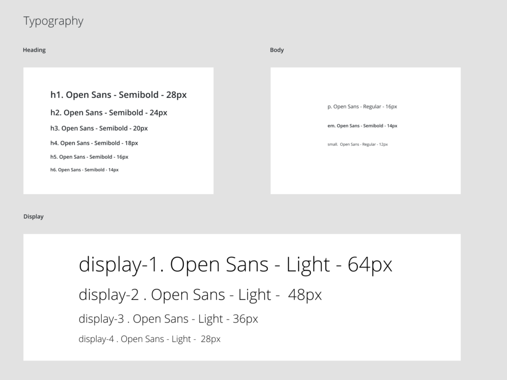
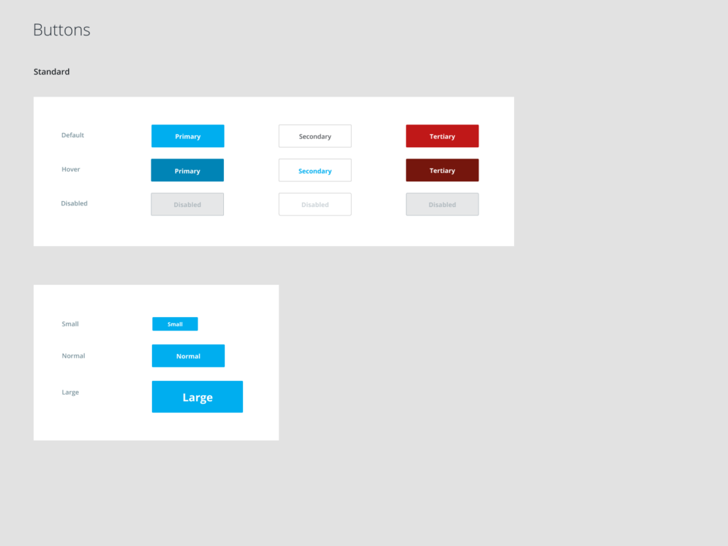
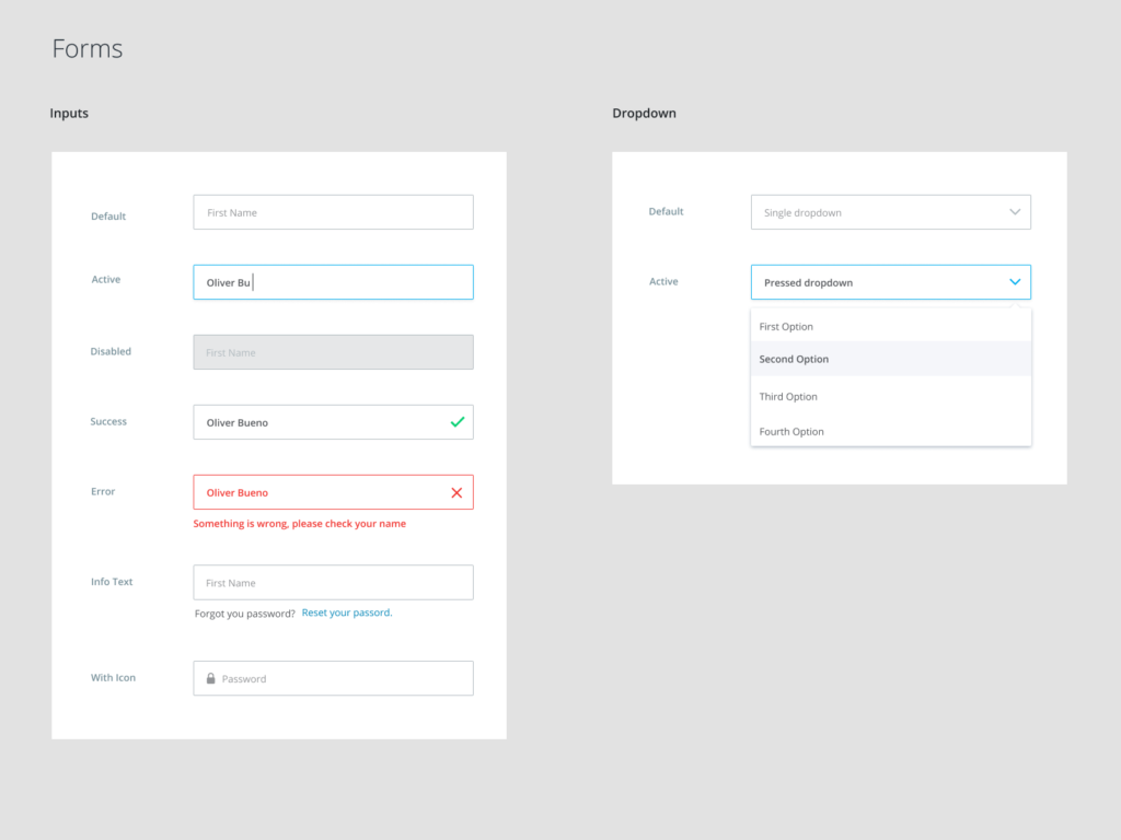
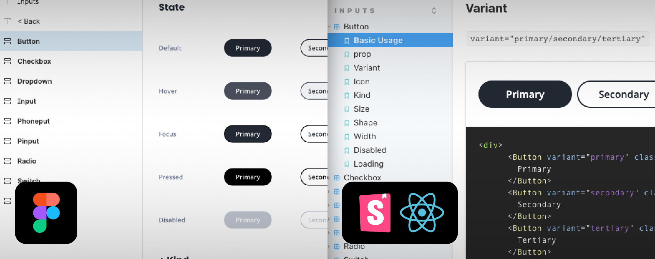
A full featured Figma library was published to the design team for use throughout all product design specifications. Below are some early stages showing early specifications for color, typography and components. Examples of later stages can be seen upon request.

Development

We first developed a full set of components to match 1:1 with our final Figma design library in exacting detail. Every input, alert, surface, navigation or content component was implemented in React including all variants, interactive states and transition animations. With component specific SCSS driving the styling and the whole codebase published to an internal NPM repository, it was immediately consumed and integrated into one of our latest product redesign efforts, which is now publicly available as a beta.

In order to support legacy products, we created a duplicate library implemented in pure HTML/CSS but based 100% on the existing React library for 1:1 visual parity. This library was consumed on comprehensive redesign and reskin project for the primary legacy desktop application which also is now in production.

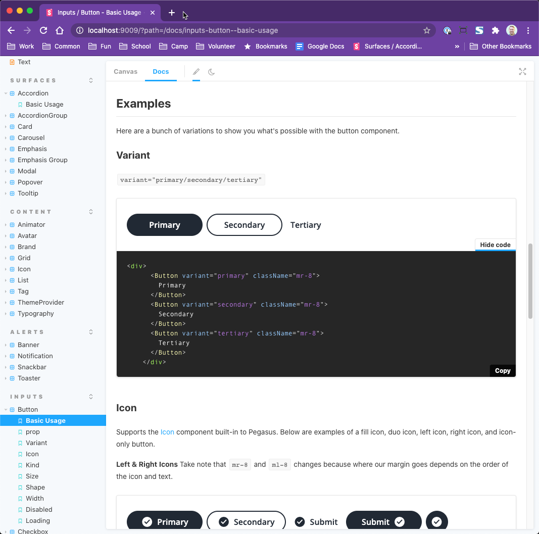
We published exhaustive documentation on an internal GitHub website using Storybook and it’s Docs add-on. Live examples of every state and variant could be viewed with copyable code snippets alongside for an ultimate reference and guide for developers.